
The Tale of Two Horseshoes: A Masterclass in Brand Dilution
For the uninitiated tourist, booking a room at the Horseshoe Las Vegas feels like stepping into a piece of pure Sin City Americana. You expect the legendary charm of Benny Binion’s 1951 gambling empire, the birthplace of the World Series of Poker. Instead, you plug the address into your GPS and find yourself at the corner of Flamingo and the Strip. You aren't at the historic, neon-drenched downtown casino. You are at a rebranded, decades-old mega-structure (the former Bally's) that corporate giant Caesars Entertainment slapped a famous name onto after a multi-million dollar buyout. The result? A massive identity crisis that perfectly illustrates the tragic gulf between authentic, retro-fun design and clinical, uninspired corporate branding.
The Soul of Old Vegas: Binion’s Neon Masterpiece
To understand what was lost, you only have to look at the original Binion’s Horseshoe on Fremont Street. The old signage was an absolute masterpiece of mid-century graphic design. Designed in collaboration with the legendary Young Electric Sign Company (YESCO), the facade was a textured canvas of golden, incandescent bulbs cradled by massive, soaring turquoise neon text. The design wasn't just a logo; it was a physical texture. It featured repeating, interlocking geometric "H" patterns made of raw sheet metal and brilliant light. It felt tactile, festive, and unashamedly fun. Inside, that design language translated into an atmosphere packed with personality:Sawdust-turned-plush carpetingLow-slung ceilingsA crowded, high-energy floor that felt like a localized, smoky cowboy saloonIt was a place where high-rollers rubbed elbows with tourists over a glass-encased display of one million dollars.
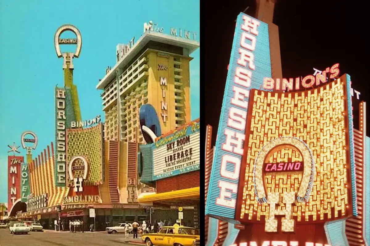
When Caesars Entertainment rebranded Bally's into the Strip’s Horseshoe Las Vegas, the soul of that design was completely flattened. Instead of miles of buzzing neon tubes, the new corporate logo is a sterilized, minimalist graphic asset. The font is a safe, blocky, uninspired serif typography. The horseshoe emblem itself has been smoothed out into a perfect, symmetrical digital vector graphic meant to look "premium" on a corporate PowerPoint deck. Why does it look this way? Because corporate identity packages are designed for scalability, not soul. A modern casino conglomerate needs a logo that can easily be stamped onto a plastic player’s club card, a digital smartphone app, and property billboards from Baltimore to Bossier City. By prioritizing standardized, clean, and scalable assets, they completely stripped away the handcrafted charm that made the original logo an icon of the Neon Museum.

The Knock-Off Horseshoe: A Branding Fan’s Nightmare
Driven by my love for logos and branding, I originally booked a stay at the corporate Horseshoe on the Strip out of pure visual curiosity. I wanted to see how its design language connected back to the legendary, retro look of downtown’s Binion's. What I didn’t realize at the time was that they weren't connected at all—I had walked right into a brilliant corporate illusion.
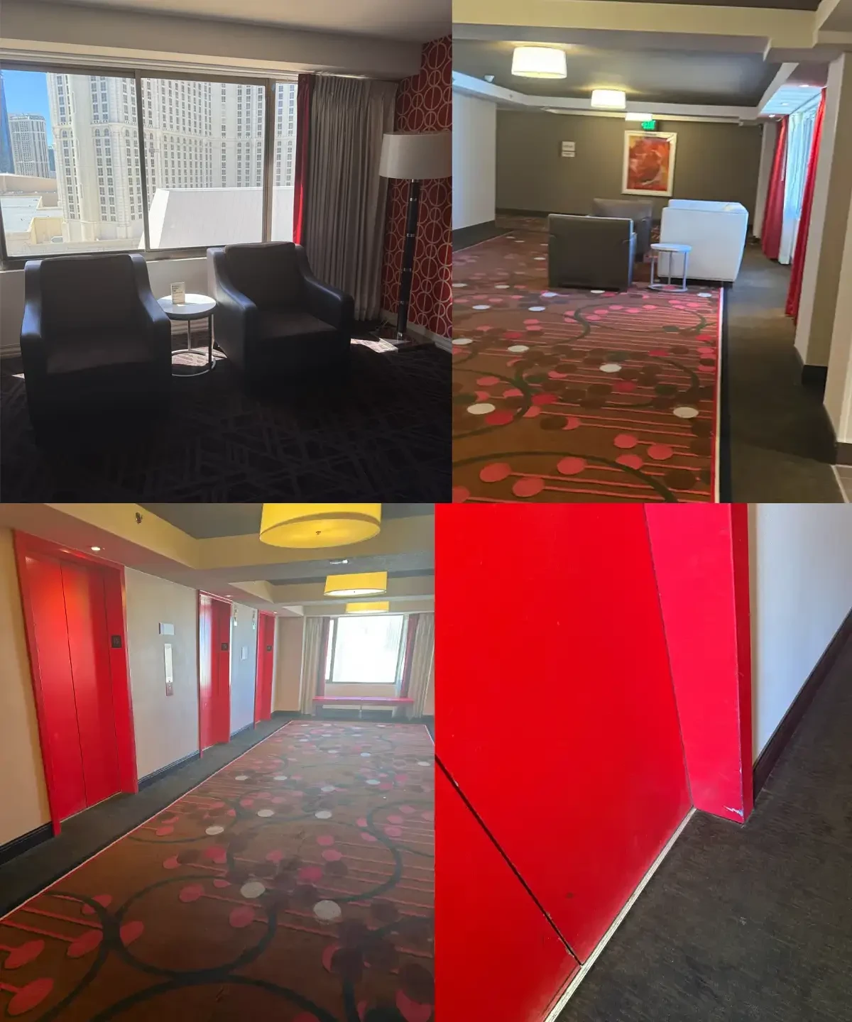
Now, I know some of you reading this might get mad at me for "poo-pooing" this property or acting like a total Debbie Downer. But let’s be real: when you are paying almost $400 a night, plus the absolute privilege of paying for your own daily parking, you expect a little bit of pampering—not a smoky time capsule that feels like an office park.The moment you look past the glossy website photos, the corporate illusion completely falls apart into a budget report titled: How to Value-Engineer the Soul Out of Las Vegas. If you were hoping for a cohesive, legendary cowboy or horseshoe theme, the hallways will quickly crush your dreams. The carpet choices scream, "What is the absolute cheapest pattern we can buy wholesale to cover up four decades of Bally’s traffic?" Instead of anything resembling luck or heritage, you are treated to a chaotic, mid-2000s bowling alley pattern featuring dull red, brown, and pink circles. To make matters worse, the walls feature a jarring, aggressive coat of red paint applied directly over the old baseboards. The trim is already chipped and peeling at the corners, revealing the tired, dusty gray layers underneath.

Jack Binion's "Lazy" Corporate Menu
When it comes to the dining experience at Jack Binion’s Steak, the branding itself looks like it was whipped up in Microsoft Word using standard Arial and a generic, flat maroon horseshoe graphic asset stamped onto the top. It feels a bit optimized for a corporate PowerPoint slide rather than a historic family legacy.To be fair, though, the dinner itself turned out to be quite good! The food was perfectly enjoyable—it just didn't quite hit that hyper-luxury, 5-star fine dining level you might expect when you see the iconic Binion name on the door.
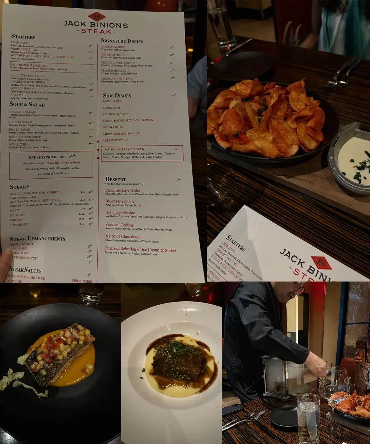
As a Canadian, I was instantly hit with nostalgia when I saw the "Ketchup Spiced House Potato Chips & Dip" on the starter menu. Ordering those brought back instant childhood memories of standard Canadian snack runs. For the main courses, both the steak and the salmon were well-prepared, flavorful, and hit the spot. I was also genuinely impressed by the presentation of the drinks, especially watching a cocktail pour elegantly out of a tabletop beverage urn. The service was decent and everyone was perfectly pleasant, even if the overall environment felt a little more commercial than old-school gourmet. It's a fine meal to fuel a night of slots, trading historical grit for modern, predictable corporate comfort.
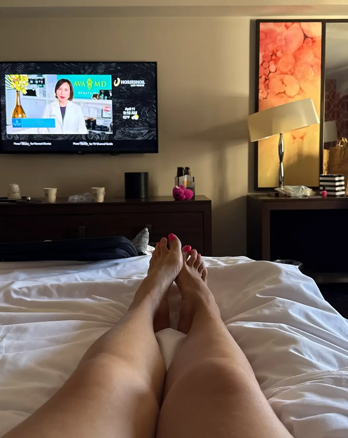
Beyond a perfectly solid dinner, there were a couple of definite perks during my time at the corporate Horseshoe:Zero Critters: I am incredibly happy to report that I didn't spot a single roach or bed bug during the entire stay. In a building this old and heavily trafficked, that is a genuine victory. The "Breathtaking" View: The window view was an unforgettable architectural journey. If your dream vacation involves staring directly at a vast, industrial expanse of flat gray gravel roofing, heavy-duty HVAC cooling towers, and a distant, highly obstructed peak at the Strip, this room delivers in spades.Ultimately, the Strip's Horseshoe is a visual reminder of what happens when modern casino conglomerates prioritize standardized, scalable corporate identity packages over handcrafted, regional quirk. They successfully bought a legendary name, and while it makes for a perfectly acceptable, middle-of-the-road Strip stay, they completely forgot to import the original soul.